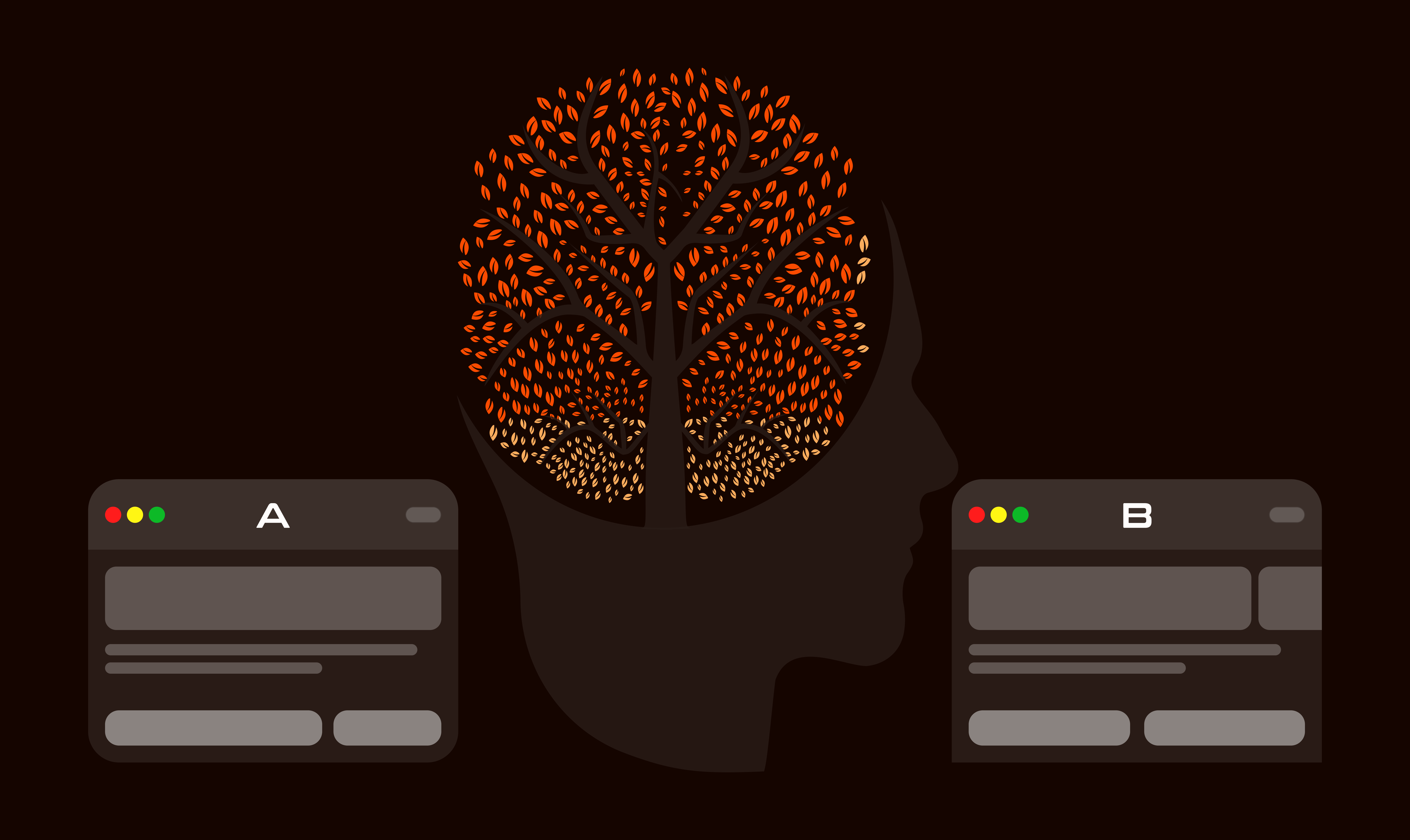

When creating A/B testing variations, it is essential to design them in a way that not only produces the desired results but also abides by the following key principles. Here are the top five principles to be considered when designing successful variations for A/B testing.
Branding
One of the key aspects in A/B testing is keeping the brand consistent, it is essential to ensure that any changes comply with the visual and messaging identity of your brand. This uniformity of all elements and channels strengthens the brand identity and creates trust in your audience.
Customer Journey
It is crucial to also focus on the customer Journey which involves optimizing the path users take from the first contact with your brand to the final action, such as making a purchase. The goal is to enhance this experience. Once you create hypothesis on which touchpoints could be the most important in this process, you can create experiments based on that and measure how they impact the user behavior and conversion rates.
For example, we introduced a countdown timer for the next day delivery. That same countdown timer was used on the PDPs, Basket page and the Checkout page. Having the same design for the countdown timer throughout the journey made a significant difference on the overall conversion rate.


Link - https://guessthetest.com/test/with-or-without-the-next-day-delivery-timer/
User Interaction
Another key area of high importance when designing variations is interaction. This covers the engagement with the user’s interface from the point of the first interaction to the point of conversion. When optimizing user interaction, the goal is to enhance it and make it more intuitive. It is important to strike the balance between being subtle enough not to distract the customer, but also engaging enough to achieve the desired results such as conversion rates.
We know that many people in this industry believe that CTA tests are the simplest form of tests and that people should be thinking bigger and bolder. No doubt about that! However, there have been cases where making small changes can have a large impact.
Examples of such variations would be button responsiveness - testing different feedback mechanisms such as animation on click or when hovering over the mouse - interactive elements such as sliders or expandable sections (read more), or utilizing subtle animations or motion effects on some of the critical elements like CTA’s in order to grab the user’s attention without being too distracting.
Sliders are also crucial in this context; creating sliding animations such as image carousels or product showcases can make the experience more engaging for users..
As for a specific example of successfully creating a sliders variation, the testing team producing tests for Burton Publishing has decided to create an experiment for the client testimonial section, making it more interactive by creating a slider to increase the conversion rate. The results confirmed the hypothesis. Not only did choosing the winner improve sales by 16.2% compared to the static version, but also it increased the Revenue Per Visitor by 30.7%.
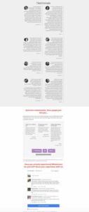
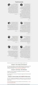
Link - https://guessthetest.com/test/with-or-without-the-testimonials-slider/
Content Area
When crafting experiments, focusing on the content area is also essential. This is to examine and find out how the content arrangement affects user engagement and conversion rates. The ultimate goal of such an experiment is to enhance user retention, readability, and user engagement. This can be done by modifying the layout, content type, and overall presentation.
There are several ways of changing the content area, which may include increasing or decreasing the content length, incorporating multimedia elements (such as videos and graphics), adjusting call to action placement, headline testing, and experimenting with the ratio of image to text content. Another way of creating a variation would be producing a hero image for one of the tests and another one without such an image. Tinuiti ran this test for American Automobile Association of California with the idea that a large Click to call button would make it easier for users to request a quote.
The A/B tests have proven that indeed the interface not having the hero image and leading straight to the quote section, increased the click to call conversions by 180% making it a clear winner in this particular case.


Link - https://guessthetest.com/test/with-or-without-the-hero-image-on-mobile/
Window Resizing
If the requested tests are designed for several devices, each variation also needs to be created specifically to cater for the window size of the device it will be used on. The goal is to ensure we adapt to the layout, design, and functionality of all screen sizes to assess how these changes impact usability and conversion rates.
There are several aspects of window resizing that need to be considered:
- Functionality: Seeing that all interactive elements such as dropdowns and sliders work correctly on all devices
- Layouts: making sure the layout is consistent across devices and remains visually appealing
- Visibility: ensuring all texts, interactive elements, and images are visible without having to zoom on smaller screens
You can apply the window resizing tests by using Fluid Grid Layouts, which use the ratio percentage of the grid instead of fixed pixels, or adaptive images that adjust depending on the device.
In conclusion
Every test should not only determine which variations work better but also provide a deeper understanding of user behavior and preferences. These design principles will help you and your team to create the variations that not only “works”, but also follows the site itself and help you achieve your CRO objectives.
Reference: www.GuessTheTest.com