Understanding human behavior is crucial when creating user experiences (UX) so that interfaces can engage people and generate results. One of the most effective ways to gather insights into user preferences and decision-making processes is through A/B testing. However, A/B testing is not just about numbers and analytics—it’s deeply binded with UX psychology, the study of how users interact with and perceive digital interfaces.
The Link Between A/B Testing and UX Psychology
UX psychology examines how design elements influence user behavior. From cognitive load to decision fatigue, understanding psychological principles helps designers craft experiences that feel intuitive.
Here are some key psychological principles that inform A/B testing in UX:
1. Cognitive Load
Cognitive load refers to the mental effort that is required to process any information.
Our memory tends to hold a very small amount of information at a time. The lower the cognitive load, the easier it gets for the users to navigate and interact with a design.
A/B Test Example: Simplified Navigation
Version A: A complex, multi-layered navigation menu with so many options.
Version B: A clean, simple but more concise navigation menu with few categories.
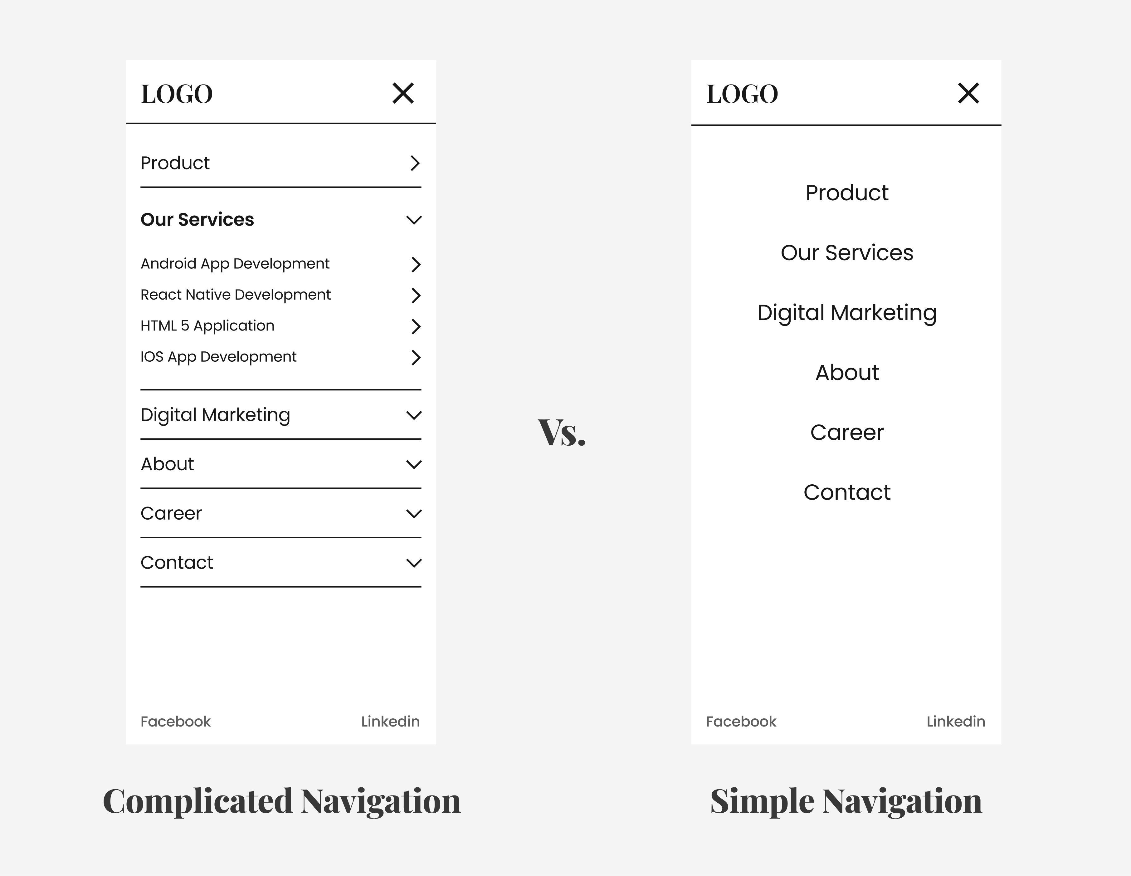
A comparison between a complex vs. simplified navigation menu.
Psychological Insight: According to cognitive load theory, presenting too many options can confuse users, making it harder for them to find what they're actually looking for. By simplifying navigation, we reduce cognitive load, improving the likelihood that users will find and engage with content more easily.
A/B Test Result: Version B, with the simpler navigation, leads to a higher conversion rate because users experience less friction and can easily make decisions.
2. Fitts' Law
In simpler terms Fitts law states that, the bigger the distance to the target, the longer it will take for the pointer to move to it. In other words, closer targets are faster to acquire. If the target is bigger it's better.
A/B Test Example: Button Size and Placement
Version A: A small, hard-to-find button placed at the top of the page.
Version B: A bigger button positioned at the center of the screen, where people tend to focus.
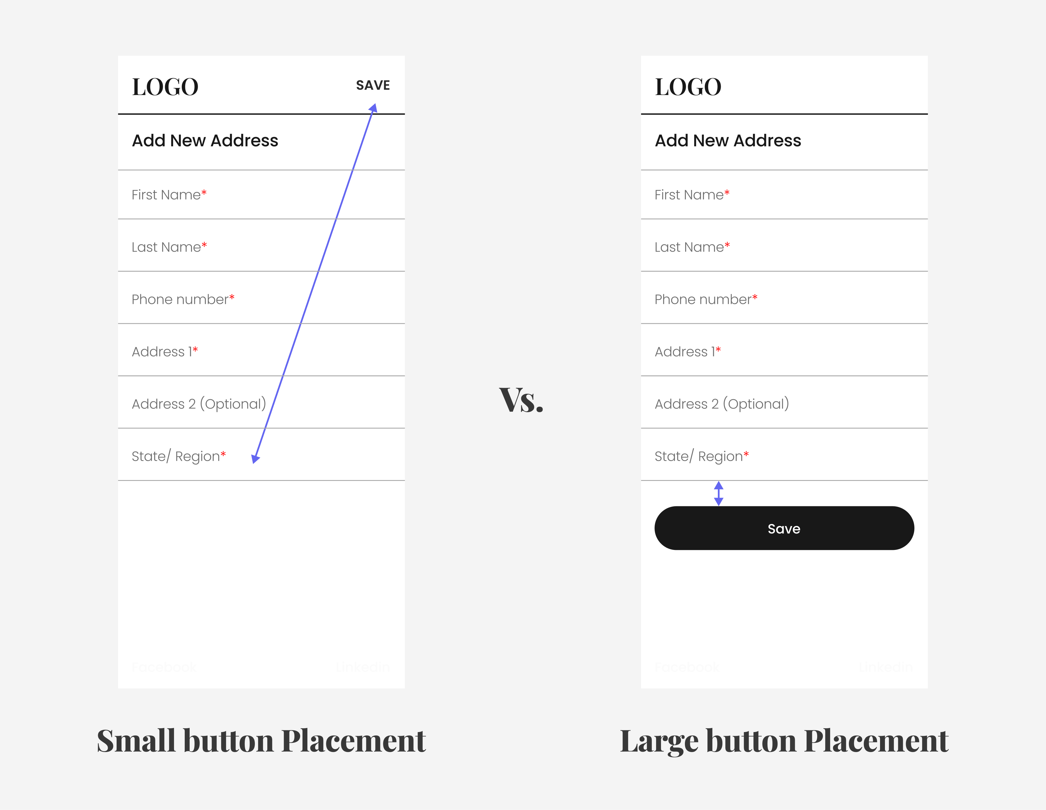
Comparison of small vs. large button placement on a webpage.
Psychological Insight: By making buttons larger and placing them where users' eyes naturally land (like the center of the screen in the 2nd image), we reduce the time it takes for users to make decisions, increasing the ratio of user engagement.
A/B Test Result: Version B, with the larger button in a more prominent position, results in higher click-through rates and more conversions.
3. The Anchoring Effect
The anchoring effect is a cognitive bias where people rely heavily on the first piece of information they see (the "anchor") when making decisions. This can really influence pricing, options and choices.
A/B Test Example: Pricing Display
Version A: A product page displaying the price without any context.
Version B: A product page, but with a "premium" version listed a higher price.
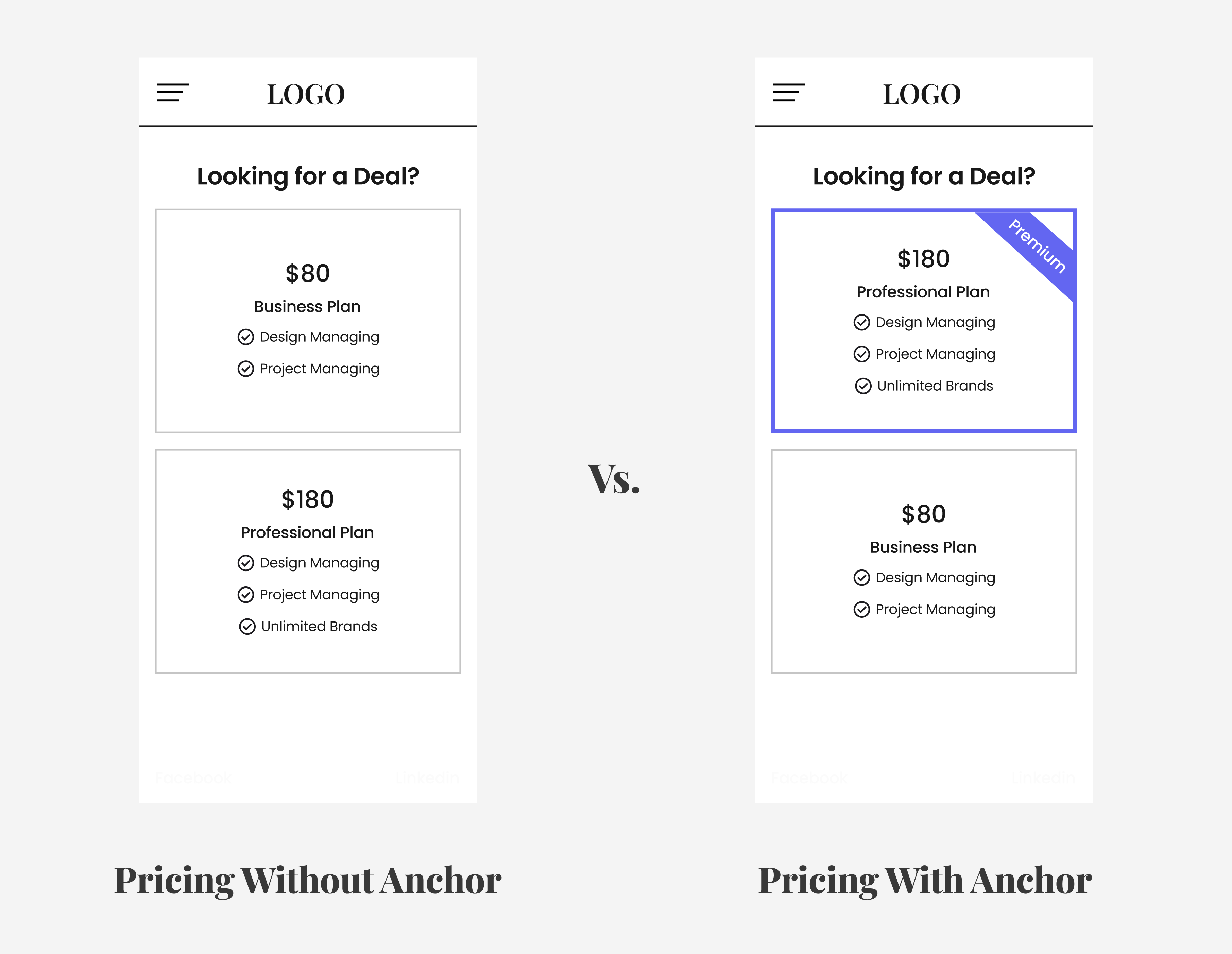
A comparison of pricing with and without an anchor.
Psychological Insight: By showing a higher-priced option first (the anchor), it seems like a better deal to go with the lower priced one. This plays into the anchoring bias, making users feel like they're getting a bargain.
A/B Test Result: Version B, with the higher-priced product first, results in more sales because users are influenced by the anchor.
4. Social Proof and Trust
Social proof is a psychological phenomenon where people tend to follow the actions of others. This is why user reviews can significantly influence purchasing behavior.
A/B Test Example: Displaying Customer Reviews
Version A: A product page without any customer reviews.
Version B: The same product page with prominently displayed reviews and a 5-star rating.
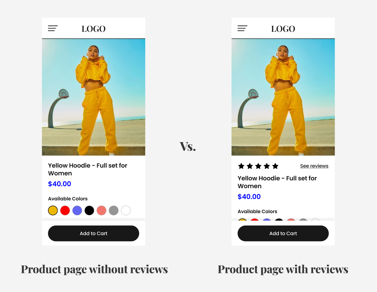
A comparison of a product page with and without reviews.
Psychological Insight: If we give the user this idea that people are taking this product and are happy with it, it’s a psychology that encourages users to react positively. By displaying reviews, we increase trust, which leads to higher conversions.
A/B Test Result: Version B, with customer reviews, has a higher conversion rate because it makes the potential customers more confident about their choice.
5. Scarcity & Urgency
The scarcity principle is a psychological trigger that makes users feel they need to act quickly when resources/ assets (such as products or deals) are limited. This urgency principle makes users feel the need to act now before an opportunity expires.
A/B Test Example: Countdown Timers
Version A: A product page with no countdown timer.
Version B: A product page with a countdown timer showing limited availability or a special offer which will be over soon.
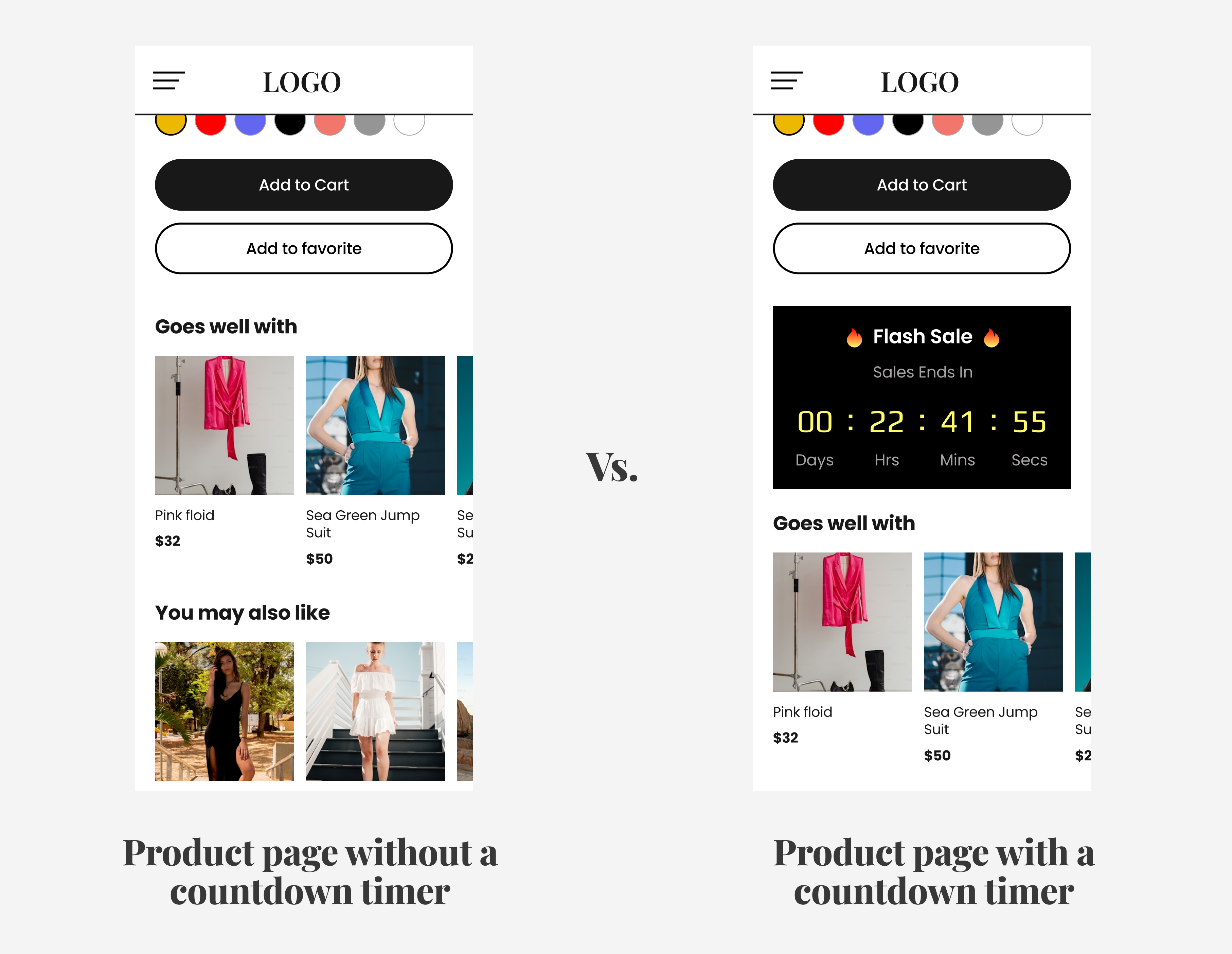
A product page with and without a countdown timer.
Psychological Insight: When users see that an offer is limited, they experience FOMO (fear of missing out) and are more likely to make a purchase. A countdown timer creates a sense of urgency and triggers users to make quicker decisions.
A/B Test Result: Version B, with the countdown timer, results in more conversions, as users feel obliged to act before the offer expires.
Conclusion: The Power of A/B Testing in UX Psychology
A/B testing is a powerful tool for optimizing user experiences, but it’s not just about testing for testing’s sake. It’s about understanding why users make certain decisions and using that knowledge to create more effective designs.
We can create a more satisfying experience for the users by incorporating these UX psychology principles and at the same time we can improve user conversions.
As we continue to run A/B tests, it should be kept in mind that UX psychology isn't about manipulating users—it’s about understanding their natural behaviors and designing experiences that meet their needs in intuitive, user-friendly ways.
Happy testing!

